Get your FREE GUIDE '7 Steps to grow a Quilt Pattern Design Business'

personal preference
On seeking unicorns.
Stationery. I hit on this a little in my journal entry processing ideas, but that was more about sketchbooks. This is more about notebooks. Can you tell I have a stationery fetish?
Notebooks
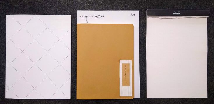
I have been taking a lot of notes lately. And have gotten pretty attached to certain types of notebooks. I started with a moleskin cahier, and love the strange size, the non-A4-ness. I have been using XL, cahier, kraft cover. The saddle stitching. The weight of the cover.
BUT… The paper colour doesn’t really do it for me though. I do love a crisp white page. And the weight of the paper – I find it a bit flimsy. Especially given my pen preference (more on that later).
I love love LOVE Rhodia paper. Dot pads. So smooth. It’s really a noticeable difference in the glide and smoothness of the paper. There’s something really pleasurable about whipping along with your pen/pencil.
BUT (uh huh…., there is a but), I don’t like that the covers of the notebooks are emblazoned with their logo. And while the perforated tear off pages are useful, the format of the page is a bit of a weird shape after you tear it off. Visually you get used to the top fold over, but when you tear off a page the proportions are all a bit weird. I’m a nitpicker. What can I say?
Then I found Northbooks. Dot page. Smooth (not Rhodia smooth, but…), white. Great format, a little smaller than A4, not quite letter.
BUT (uh huh… again…) they are glue bound, and don’t open nice and flat.
So, I guess I am looking for what my husband would call a unicorn. A mythical beast, far beyond the attainability of us mere mortals. A rhodia-cahier-northbook.
A RhoCaNo book.
Sigh. One can dream. If you know of one, please let me know!
Pens
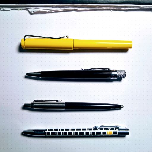
Preference at the moment runs to gel ink, roller ball. Dark black.
I have some refills for my Lamy safari (bright yellow of course…). They don’t last long, but I do like the thickness of the pen and the feel in my hand. Not too heavy.
A recent arrival in the stable is a Retro 1951 – great heft, and excellent thickness and ink too. Maybe a little too hefty.
I have a favorite (a gift from a dear friend), and a nostalgic (a reminder of the past) too. But these are too skinny, and I think they make my hands hurt if I write with them too long (I have big maker’s hands).
Definitely black ink.
What about you?
Plain/grid/dot/lined?
Black/blue/red/rainbow?
Thick/thin/heavy/light?
Or maybe you don’t use any analogue writing tools at all.
Three more for you:
And one last thing:
In honor of World Stationery Day that happened this week.
Never Enough Stationery – the perfect way to remember the spelling of stationEry.
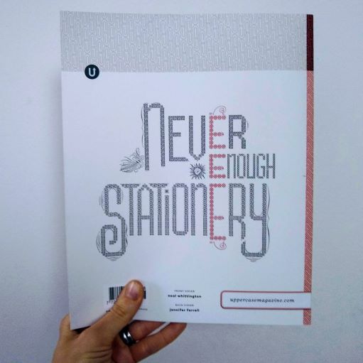
Never Enough Stationery
Uppercase Magazine 48 | Artwork by Jennifer Farrell
Oh, and my favourite artwork? It was staring me in the face the whole time… Boccioni!
What’s your favourite artwork? Leave me a comment and let me know!

See??
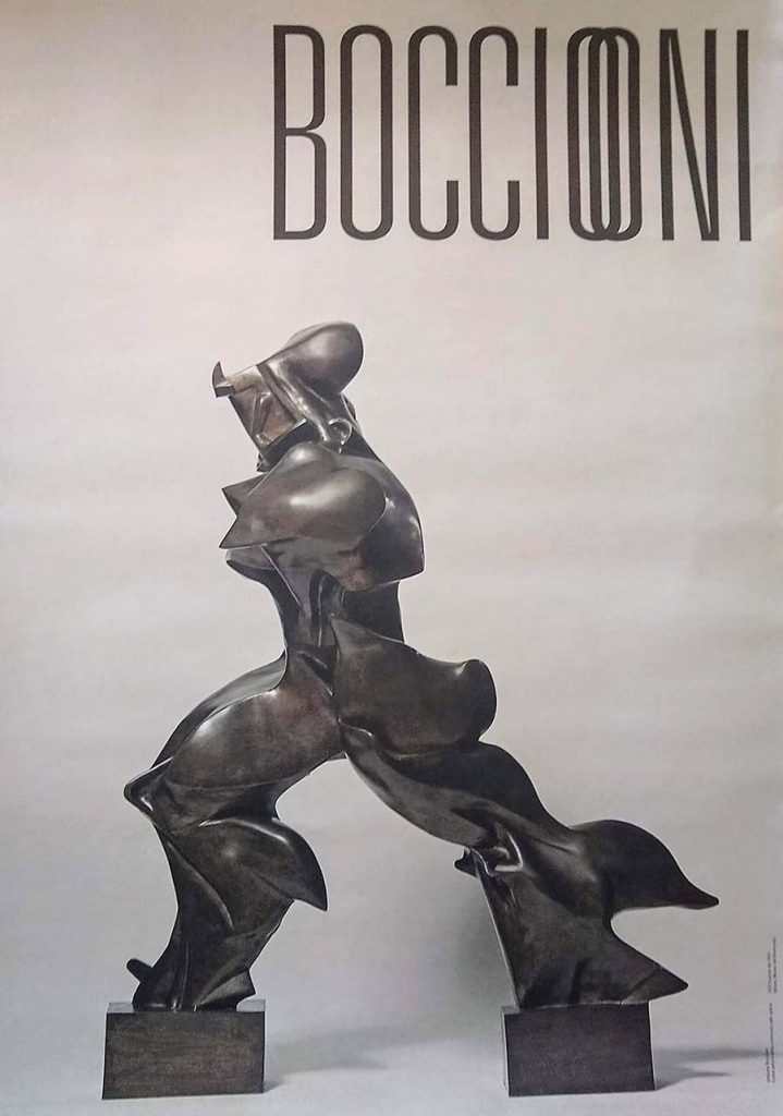
Unique Forms of Continuity in Space
Umberto Boccioni | bronze | 1913
I understand all these things when looking for the perfect notebook Ally. I can’t go past Stillman & Birn Alpha series. Alpha is 150 gsm white paper which takes everything beautifully, from ink to pigment liners, markers, and watercolour. It doesn’t have the smoothness of the Rhodia paper, but has a slight tooth with no bleed-through. I like the 10 x 8 inch soft cover version with rounded corners, and I carry a tiny landscape one of these – 5.5 x 3.5 inch with me. The cover colour doesn’t excite me. I’ve never been a maroon person, but I can overlook it for the quality of the paper. The hardcover journals are black.
Oooh Maxine, those sketchbooks look and sound divine (and yes I am with you on the maroon). I might have to try one out next time. Wonderful to know I am not alone on my quest for the notebook unicorn.